Graphic Design

We love design, it’s one of our specialties! One of our favourite design phrases is — ‘There are 3 responses to any design: Yes, No, and Wow. We always strive to deliver that wow factor. We have good instincts and taste in design, and we have high-standards, so if we like it, there’s a strong likelihood it will resonate with your audience.

Whatever you need, we can do it.
Check out some samples from our past work.

Social media

From static images to video, we are deeply passionate about creating on-brand graphic assets that communicate your message and make your audience stop scrolling.

Candidly, video tends to perform better on organic social so we recommend steering more in that direction.

For more information about social media strategy, please visit our social media page.

Advertising

Advertising is a broad term that can encompass a lot of design elements from:

  • print flyers / mailers
  • brochures
  • signage
  • display ads
  • video
  • billboards
  • business cards, etc.


For more information about advertising, please visit our Advertising page.

Here’s a concept poster we made for Lamborghini (they did not commission us for this). We used a clean, minimalist style with thin typography and dark tones to create a sense of elegance, sophistication, and mystique. 

We went with the header ‘Worth the Wait’ for a few reasons:

  • Short and concise
  • The two ‘W’s sounds good
  • ‘Worth the weight in gold’ is a common phrase connoting value
  • ‘Worth’ is a word strongly associated with value
  • Subconsciously, it implies that someone may have aspired for such an automobile their entire lives, now that they’ve reached a point in their finances where they can finally afford it, that dream can be realized. It was worth the wait.
  • Could also imply this was a car enthusiasts were anticipating all year, and now that it has finally arrived, it creates a strong psychological release (aka demand)

Before

After

My take on Timex’s copy is:

  • It’s too wordy for a billboard
  • The watch is too small
  • The logo is too small
 

People are likely driving by 60-100 km per hour. There’s no way they will read all that small and wordy copy, nor see the watch and logo.

Now, to be fair, if this were to be placed in front of a café in a busy downtown core, then it may work.

I would suggest rewriting the copy as either: 

  • No More Annoying Notifications; or
  • 100% fewer notifications
 

It gets the same message across with fewer words.

I would also blow everything up (the product shot, text, and logo).

I like using negatives in copy such as ‘no more’ or ‘fewer’. Studies show using negatives in copy is proven to be a lot more engaging.

My version is much more short and concise. It’s also less on the nose – it makes the audience have to work for it a bit, which will help it resonate.

Before

After (v1)

After (v2)

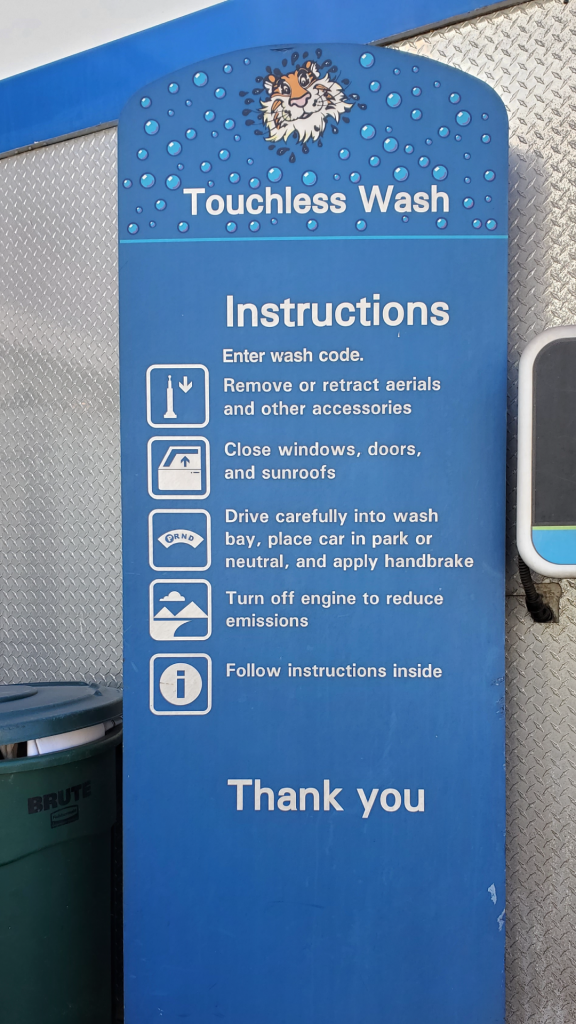
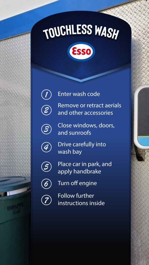
Redesigning an Esso carwash sign. Here are some of the issues we found with the original.

👉 Off-centre text (Instructions and Thank You)

👉 The tiger is off-brand

👉 I get the tiger is shaking off water, but it adds to the clutter

👉 Too many soap bubbles (adds unnecessary clutter)

👉 The title ‘Instructions’ is unnecessary

👉 Makes poor use of hierarchy

👉 The ‘Thank you’ is unnecessary

👉 The icons are misaligned with the accompanying text

👉 There is one fewer icons than text

👉 The icons are unnecessary (adds clutter without providing value)

👉 One of the instructions could be broken up into two separate points

👉 Enter wash code has a period, others do not

👉 The spacing between instructions is inconsistent

👉 Poor utilization of space

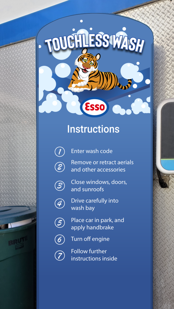
Version 1 is more consistent with their current sign, it’s lighter and more playful. Version 2 was inspired by their gift card and is darker and more ‘serious’. 

Website design & development

We have a whole webpage dedicated to web design and development. To see more examples, click here.

Before

After

For more details about the Axe Body Spray redesign, please visit here.

Content

From blog content, infographics, ebooks, white papers, podcast graphics, and case studies, we do it all.

Content and copywriting is one of our core specialties. For more information, please visit our Content & Copywriting page.

Logos & Branding

When it comes to logo design, the real talent is in coming up with simple, yet memorable designs. Think of logos from Nike, Apple, Amazon, Target, Twitter, Adidas, Louis Vuitton… none of these logos are complex or difficult from a design perspective, but they work.

So when designing logos for brands, we think very deeply about trying to come up with the next iconic logo that people remember and reference for the next 100 years. No easy task, but we’re up for the challenge!

For more information about branding, please visit our branding page.

Book covers

As mentioned in our about us section, our founder, Ewan is an author of 17 books under the pen name Edward Mullen.

We designed the cover art for all the books. For more information, please click here.

Before

After

The cover on the left is the original book cover for Always Looking, by John Updike, designed by legendary book cover designer, Chip Kidd (designer of Michael Crichton’s Jurassic Park cover among many others).

Product packaging

We work with a variety of brands from consumer package goods, board game companies, food & beverage brands, authors, and more.

For more information on our branding, please visit our branding page.