Content & Copywriting
Three Levels of Copywriting: Bad, Good, Great
What does great copywriting look like? Consider this example:
❌ Bad copywriting = what is it? (face cream).
✅ Good copywriting = what does it do? (gives you smooth, glowing skin)
✅ Great copywriting = how does it make you feel?
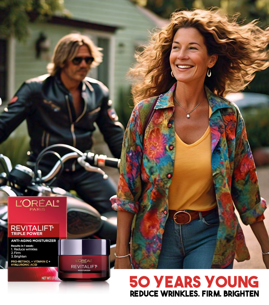
Imagine an advertisement (much like the one we’ve mocked up quickly for this example) of a hunky motorcycle rider picking up someone who looks like the target audience.
They are happy, hair is blowing, feeling confident. Here we are capturing a fantasy, representing freedom, carefreeness, youthfulness, etc.
The tagline reads: 50 Years Young
The power of great copy
Well written copy on a product description, an advertisement, or webpage can be highly influential. It can elicit positive emotional and impulsive responses that resonates with the buyer and compel them to hit the ‘Add to Cart’ or ‘Buy Now’ button.
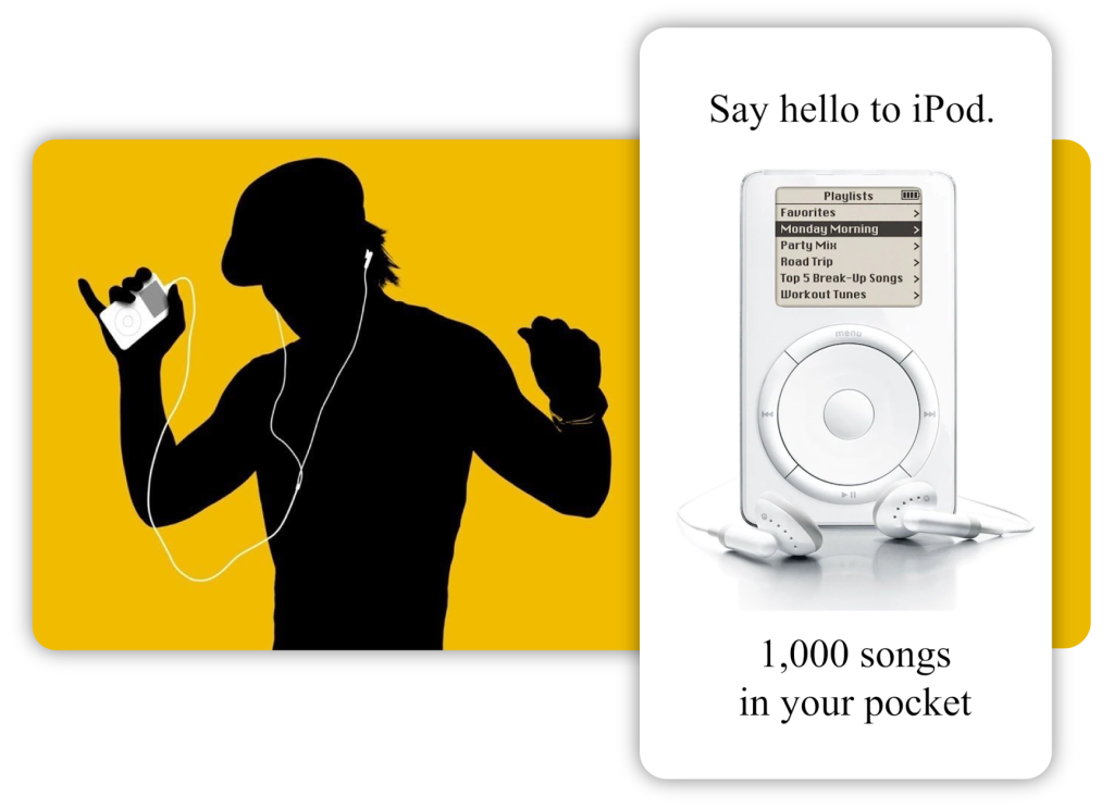
Apple’s famous “1,000 songs in your pocket” perfectly demonstrates how to:
- Be clear and concise
- Highlight a pain point
- Showcase benefits, not features

Blog posts

Social media

Webpage copy

Production descriptions

Case studies

Video scripts

Press releases

Sales enablement
"The first 1,000,000 words are practice."
In his book, ‘On Writing’, Stephen King says the first million words are practice.
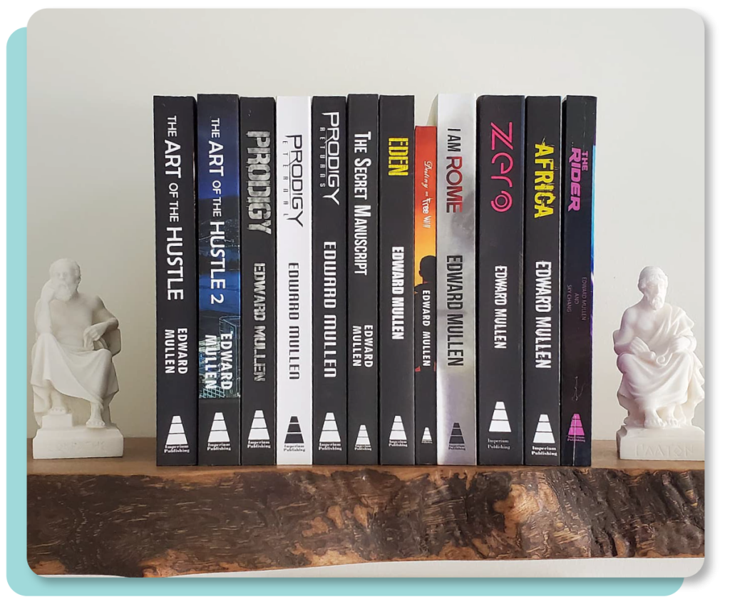
Having been a writer since I was a kid, writing short stories and poetry, then graduating with a degree in philosophy (a very writing-centric field), a degree in Technical Writing, publishing 17 books, hundreds of blogs, and working as a professional writer for over a decade, I’d say I have had a fair amount of practice.

The art of storytelling
Storytelling marketing is about using a narrative to communicate a message. It’s effective because as a species we are hardwired to consume and tell stories.
Stories draw us in, make us emotionally invested, and help the messaging stick.
Continue reading: What is Storytelling Marketing?
Related Posts about Content Marketing
Craft your message for conversion
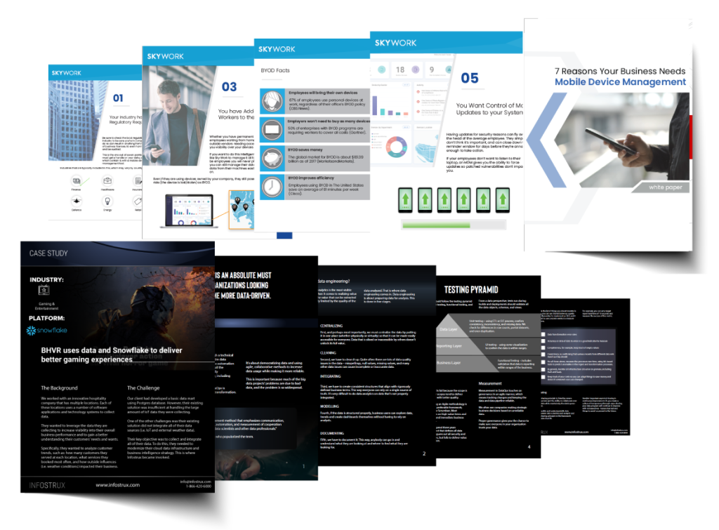
Whether you need website copy, blog content, corporate ghostwriting, technical whitepapers, case studies, video scripts… we do it all.
Using A/B tests and years of experience, we can create copy that drives consumers to take action.
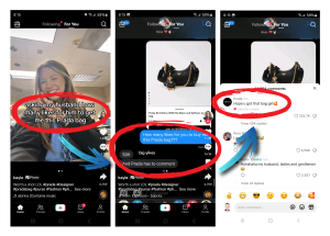
Check out some of our copy breakdowns on TikTok.
Rewriting Timex's Bllboard
This Timex billboard was praised for taking a witty swipe at smartwatches – and relentless notifications
It says, “Know the time without seeing you have 1,249 unanswered emails.”
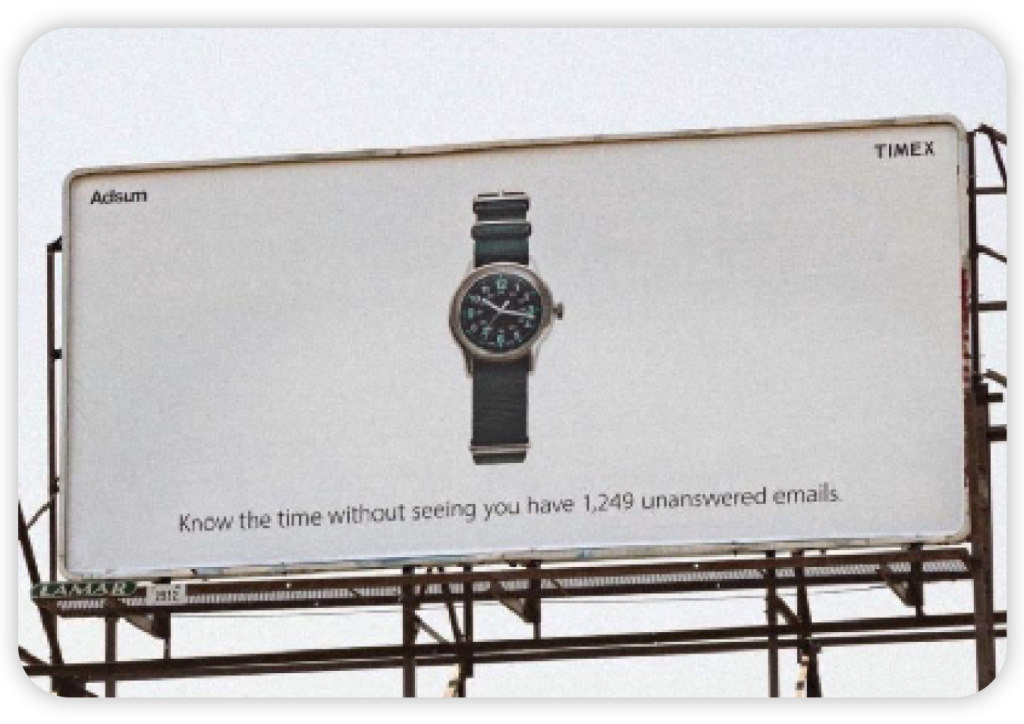

My take on Timex’s copy is:
- It’s too wordy for a billboard
- The watch is too small
- The logo is too small
People are likely driving by 60-100 km per hour. There’s no way they will read all that small and wordy copy, nor see the watch and logo.
Now, to be fair, if this were to be placed in front of a café in a busy downtown core, then it may work.
I would suggest rewriting the copy as either:
- No More Annoying Notifications; or
- 100% fewer notifications
It gets the same message across with fewer words.
I would also blow everything up (the product shot, text, and logo).
I like using negatives in copy such as ‘no more’ or ‘fewer’. Studies show using negatives in copy is proven to be a lot more engaging.
My version is much more short and concise. It’s also less on the nose – it makes the audience have to work for it a bit, which will help it resonate.
Continue Reading: What’s the ROI of a Billboard?
Rewriting and Redesigning Axe's Webpage
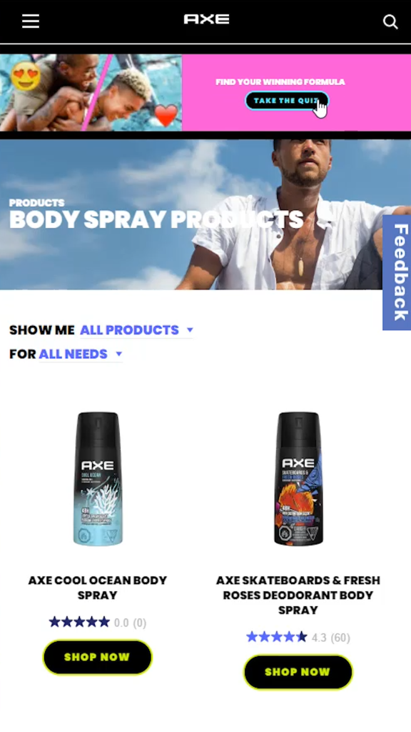
We found a few issues with Axe’s Body Spray page (left image).
- The quiz they had at the top was really overpowering. I would bury that further down the page
- Their hero copy (Products – Body Spray Products) is uninspiring and lazy in my opinion
- The hero image is also quite lackluster in my opinion
- The feedback tab on the right looks too much like Facebook, I would remove that
- The ‘Show me All Products’, and ‘For All Needs’ is too wordy, unattractive, and perhaps not obvious that users can interact with them
- The star ratings on the product look messy, and the popular scents cannibalize the not-so-popular scents
- The CTAs ‘Shop Now’ is alright, but a little basic. I also don’t love the yellow outline, and it’s not horizontally aligned
ORIGINAL
OUR REVISION
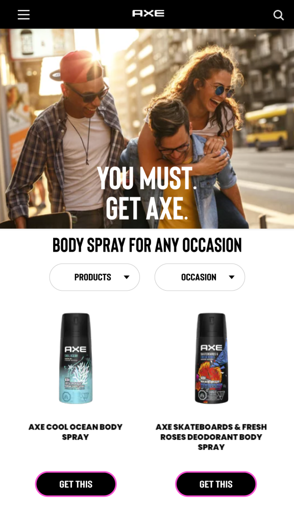
Our revision (right image) addresses the aforementioned issues.
- Removed the quiz to make the page cleaner and the hero image larger
- Rewrote the hero copy as ‘You Must. Get Axe.’ This works for a few reasons:
- It’s a double entendre – ‘You must get Axe’ is a pretty aggressive command
- It sends a subliminal message: You smell, you need Axe to solve that issue
- It plays on a person’s negative states such as fear and anxiety they smell in social settings, which can be powerful motivators
- The hero image is now much more inviting and tells a story. Perhaps a couple (man and man, or man and woman – I like that it’s ambiguous ) are having fun in the summer. The sun is setting, creating warm tones. Perhaps they are traveling, which is highly prone to causing a person to be sweaty, smelly, and sticky
- Removed the feedback tab
- Added a byline – ‘Body Spray for All Occasions’. I wanted the phrase ‘body spray’ front and centre so that people know they’ve arrived in the right place after selecting Body Spray from the menu. For all occasions is intriguing and invites people to select the ‘Occasions’ CTA
- The ‘Show me All Products’, and ‘For All Needs’ became more obvious buttons. I reduced the words to ‘Products’ and ‘Occasions’, which ties into the byline. Now with the double ‘occasions’, it creates intrigue. Visitors will naturally want to know which occasions are on the list
- Removed the star ratings on the products to make it cleaner and hide the not-so-popular scents
- The CTAs are now ‘Get This’, which is a much more fun and casual way of speaking. It also harkens back to the hero title, ‘Get Axe.’ I horizontally aligned them and made the outline that same cyberpunk pink as we saw in their quiz banner
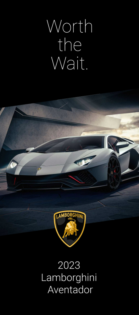
- Short and concise
- The two ‘W’s sounds good
- ‘Worth the weight in gold’ is a common phrase connoting value
- ‘Worth’ is a word strongly associated with value
- Subconsciously, it implies that someone may have aspired for such an automobile their entire lives, now that they’ve reached a point in their finances where they can finally afford it, that dream can be realized. It was worth the wait.
- Could also imply this was a car enthusiasts were anticipating all year, and now that it has finally arrived, it creates a strong psychological release (aka demand)
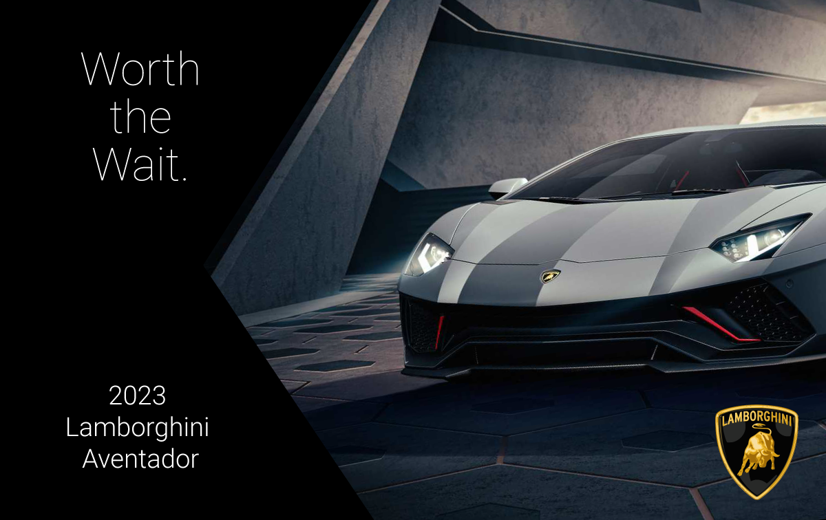

More copy-rewriting examples
Here are some copy rewrites I did for my TikTok account. These companies did not hire me – I did this for entertainment / educational purposes. For more of these copy rewrite and website teardowns, follow me on TikTok.

