Website Design

Conversion Rate Optimization

Everything we do is with the end-user in mind. When users can easily navigate the site to find the answers they’re looking for, find the products they are searching for, and be guided effortlessly through the buyer journey, that is when you will see conversions spike.

This customer-centric mindset forces us to ask questions such as:

  • Are we clearly communicating the users pain points and our value proposition? 
  • Are there clear calls to action?
  • Is our offer compelling?
  • Is the layout attractive, inviting and user-friendly? 
  • Are there any friction points that are cumbersome for the user experience?
  • Is the site SEO optimized (keywords, page load speed, intuitive navigation, URL, dead-ends, tags, etc.)
  • Are we offering self-service without the need to speak with sales (recorded demo, free trial, transparent pricing, etc.)
  • Do we satisfy the E.A.T. model, which is are we establishing Expertise, Authority, and Trust?
  • Does it feel professional and convey market leadership? 
  • Compared to our competitors, do we stand out? 
  • If we were a customer, we would we choose your product or service?
Axe Body Spray Webpage Redesign

Although not commissioned by Axe, we took the liberty of revising their Body Spray webpage as a fun / educational video to post on TikTok.

The end result was a much cleaner and easier to navigate page with more persuasive language and UX. Here’s what we changed:

  • Removed the Quiz banner from the top of the page as it was too overpowering
  • Changed their simple hero title from, “Products – Body Spray Products”, to “You Must. Get Axe.” Our new title plays on negative states such as fear of smelling badly in public, which is a powerful psychological motivator, it focuses on solving a pain point, and is a double entendre, which offers subliminal messaging in that we don’t outright state that Axe will get rid of your body odour, but that messaging is embedded into the subtext
  • Changed the hero image. The old image is uninspiring and makes the white text overlay hard to read. The new image uses warm tones, tells a story of friends or lovers (while being preference ambiguous as to be inclusive) being close, perhaps travelling, mostly likely hot and sweaty. This image subtly implies the need for the product
  • Removed feedback button as it looks too similar to Facebook’s logo
  • Added a sub-title, ‘Body Spray for any occasion’ to, 1) identify the page as a body spray page, 2) to plant a subliminal message that Axe can be used for many occasions. We again use this same language in the filter buttons
  • Added filter buttons as the before version just had text, which may not be obvious that they are links. They were also too wordy, so we revised the text to make it simpler
  • Removed rating system on products as popular products cannibalize unpopular products. Also reduces clutter.
  • Aligned CTA buttons to make them cleaner and more symmetrical. 
  • Changed the CTA colour from yellow to the branded pink that was used in the quiz banner
  • Changed the CTA text from, ‘Shop Now’, to ‘Get Axe’, which is a subliminal recall to the title, ‘You Must. Get Axe.’
Bumble website redesign

Although not commissioned by Bumble, we took the liberty of revising their homepage as a fun / educational video to post on our TikTok.

Before

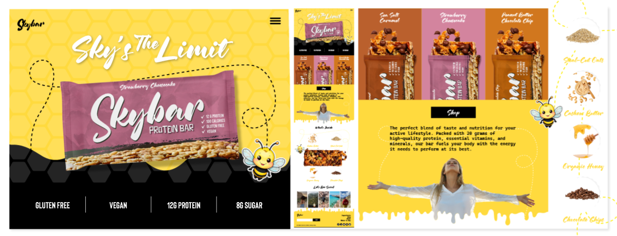
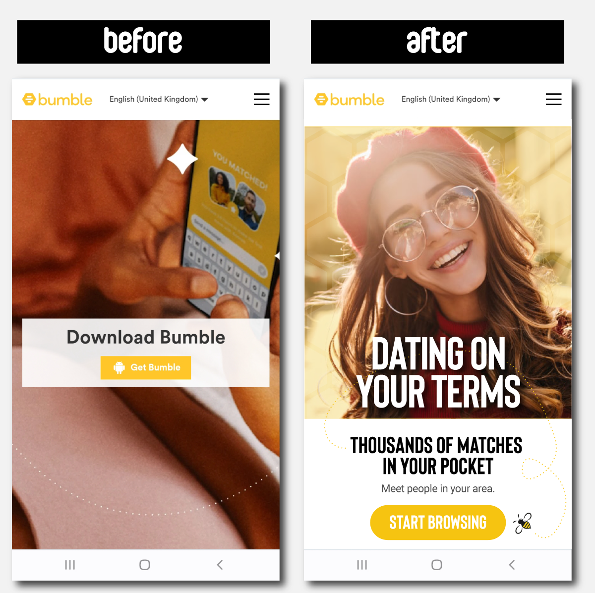
Their version (on the left)

👉 The image is dull, pixelated, and not that inspiring – the bottom half looks like, well, not sure what that this

👉 There’s no feature / benefit copy in the hero explaining what the app does or how it is unique

👉 The messaging is Download Bumble, and the CTA is Get Bumble. I’ll let you be the judge of that


After

Our version (on the right)

👉 Changed the image to a vibrant, happy gal. Perhaps mirroring the emotion the user will receive from using the app

👉 Added a honeycomb pattern behind her to be more branded and increase the warmth of the image

👉 Added a large hero title ‘Dating on Your Terms’, which, in my opinion, captures the essence of Bumble’s UVP

👉 Added a subtitle ‘Thousands of Matches in your Pocket’, to highlight the benefits of the app (of course taking inspiration from Apple’s famous ‘Thousand Songs in Your Pocket’ iPod ad.)

👉 Added subtext – ‘Meet people in your area’ – again, highlighting the benefit of using the app

👉 Added a cute little bumble bee buzzing around, leading users to the CTA

👉 Changed the CTA text to ‘Start Browsing’ which to me, is a lot more inviting than ‘Get Bumble’

Landing pages that convert

Ewanity Marketing landing page redesign

Before

A client (name redacted for privacy) was having an issue with their landing page conversion. They were receiving over 20,000 visitors, but only 1% actually completed the form.

Taking a look at their landing page (below), we noticed a few things we would recommend changing.

  • Reduce number of fields in the form
  • The recaptcha verification, although useful, is unattractive and a little jarring
  • The copy could be cleaner with more emphasis on solving a pain point for the potential customer
  • Add proof or trust points/logos (e.g. Join 100’s of other companies who love using *Company*)

After

Here are some of the changes we made:

  • Completely changed the style to make it cleaner and more modern
  • Increased text size
  • Changed the copy to emphasize the value proposition
  • Added check icons on the bulleted list to make it look cleaner and more inviting to the eye
  • Simplified the form fields
  • Removed the captcha
  • Added social proof icons (albeit placeholders)
  • Could either add a Calendly booking widget, or replace the form entirely with the Calendly widget

Is Your Website Dead? Let's Revive it