We can only evaluate an ad’s effectiveness based on data – high CTR, low CPMs, high hook rate, high conversion rate, high ROAS, etc.
But, what we can do is evaluate the ad creative.
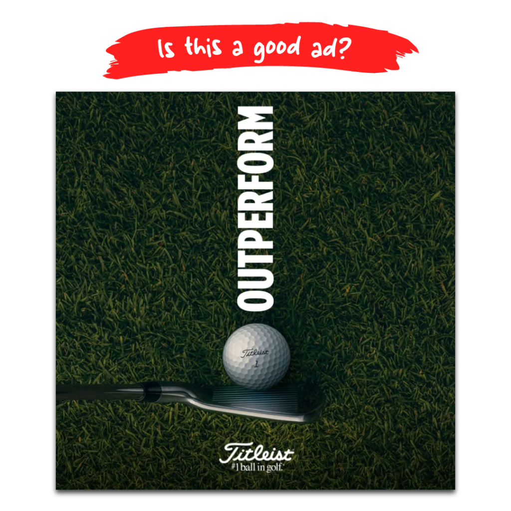
From a design standpoint, it is strong. Here’s what I like:
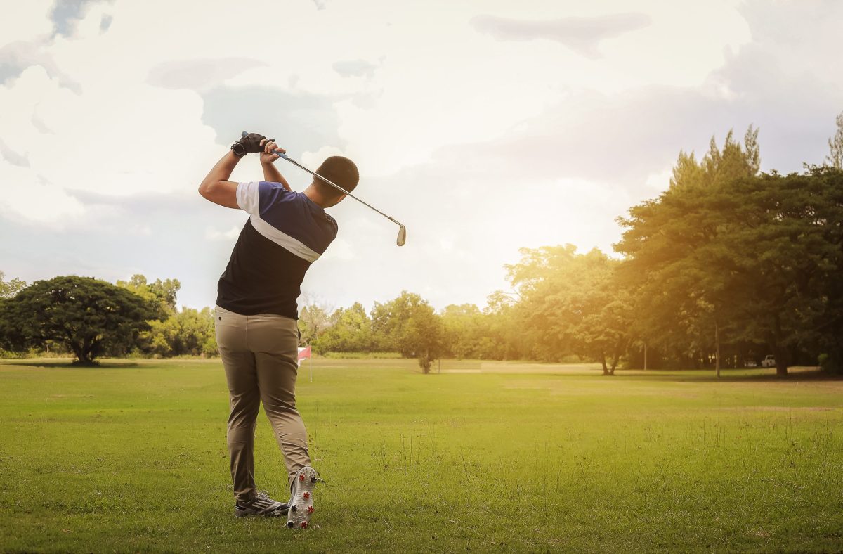
⛳ The composition is interesting ⛳ The colour of the grass ⛳ The text weight & font choice (including all caps) ⛳ The contrast between the text and the grass ⛳ The alignment (signifying a straight putt) ⛳ The simplicity ⛳ It’s professionalism ⛳ Does not use stock photography ⛳ The POV (the consumer can imagine themselves in the scene) ⛳ Word choice (using one impactful word) ⛳ The subtle highlights on the ball and club ⛳ The logo with the tagline
As you can see, it has a lot going for it.
Of course, this is just the isolated creative. There are many more elements that go into an ad such as the title, description, offer, CTA, etc.
⛳ Another thing I like, which is not shown is the ad copy: “How can you outperform the player you were yesterday? It starts with finding a ball that best fits your game.”
I like it because:
🏌♀️ It is engaging and taps into the audience’s desire for self-improvement and growth. It creates a sense of aspiration and challenge, prompting readers to consider their personal development.
🏌♀️ While the ad copy focuses on the idea of improvement and finding the right ball, it subtly promotes the brand’s products without being overly pushy. This can create a positive association between the brand and the audience’s goals of self-improvement.
🏌♀️ The line, “It starts with finding a ball that best fits your game” provides a clear call to action, suggesting that the first step toward improvement is choosing the right equipment. This can prompt readers to consider their current equipment and potentially explore the advertised product.
What do you think about this ad design?
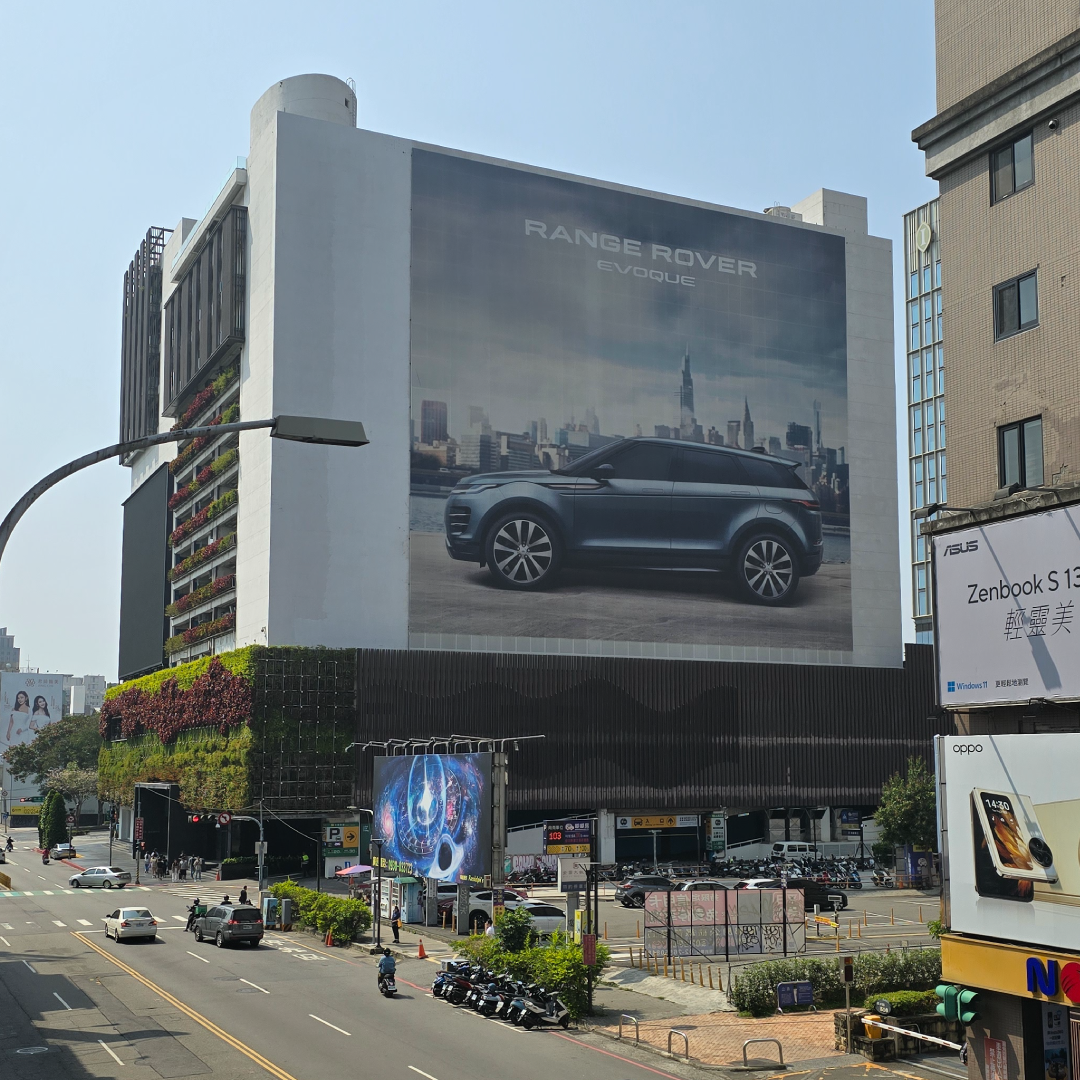
(photo taken during my trip in Taichung, Taiwan). Jaguar Land Rover UK
What Makes a Good Billboard Ad?
A good billboard ad should be attention-grabbing, easy to read, and memorable. Here are some key elements that can make a billboard ad effective:
Simplicity: Keep the message clear and concise. Passersby should be able to understand the ad quickly, even at a glance.
Large, Legible Text: Use bold, easy-to-read fonts. Avoid fancy or overly stylized fonts that may be difficult to read from a distance.
Strong Visuals: Use high-quality images or graphics that are relevant to the message and help to capture attention.
Contrast: Use contrasting colors to make the text and visuals stand out. This helps to ensure that the ad is visible and readable, even from a distance.
Relevance: Make sure the message is relevant to the target audience and the location of the billboard.
Call to Action: Include a clear call to action that tells people what you want them to do after seeing the ad.
Brand Consistency: Ensure that the ad is consistent with your brand’s overall look and feel. This helps to reinforce brand recognition.
Location: Consider the placement of the billboard to ensure that it will be seen by your target audience.
Avoid Clutter: Keep the ad simple and avoid overcrowding it with too much text or information.
Durability: Choose materials that can withstand outdoor conditions and maintain their quality over time.
By incorporating these elements into your billboard ad, you can increase its effectiveness and make a lasting impression on your audience.
If you’re looking to make a move with your marketing, reach out to us. We are priced fairly, we’re straight shooters, and are the very best at what we do.