Are you using The Car Dealership Method when designing webpages, or The Restaurant Menu?
If you’ve ever been to a car dealership, think about your experience.
It’s usually something like this:
👉 You go in with an understanding of what you want
👉 You browse, touch, test
👉 Ask some questions
👉 Discuss price and options
👉 Make a purchase
What the sales person never does, is open the user manual and spend hours going through every detail with you.
Now, think about a customer’s buying journey on your website.
Are your webpages overflowing with information like a restaurant menu?
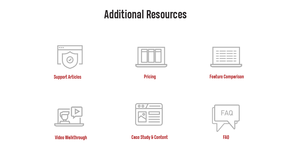
Too often I see webpages that have every single detail about the solution: features / benefits, testimonials / social proof, content, videos, pricing, FAQs, comparisons, etc.
This makes the buyers’ journey unnecessarily overwhelming, difficult to navigate, and complex.
Instead, you can keep the webpage short and sweet, giving the visitor the basics and allowing them to dive deeper in the particular path they choose.
If you look at heatmaps and scroll depth data, you’ll see that shorter pages tend to perform much better.
So why not use this information and build simpler and shorter landing pages?
All the information about the car is in the manual, and if needed, you know where to look for that.
Similarly, your website can have lots of content, but organize it in a way where the user knows where to look for it if they need it.
Most often they don’t.