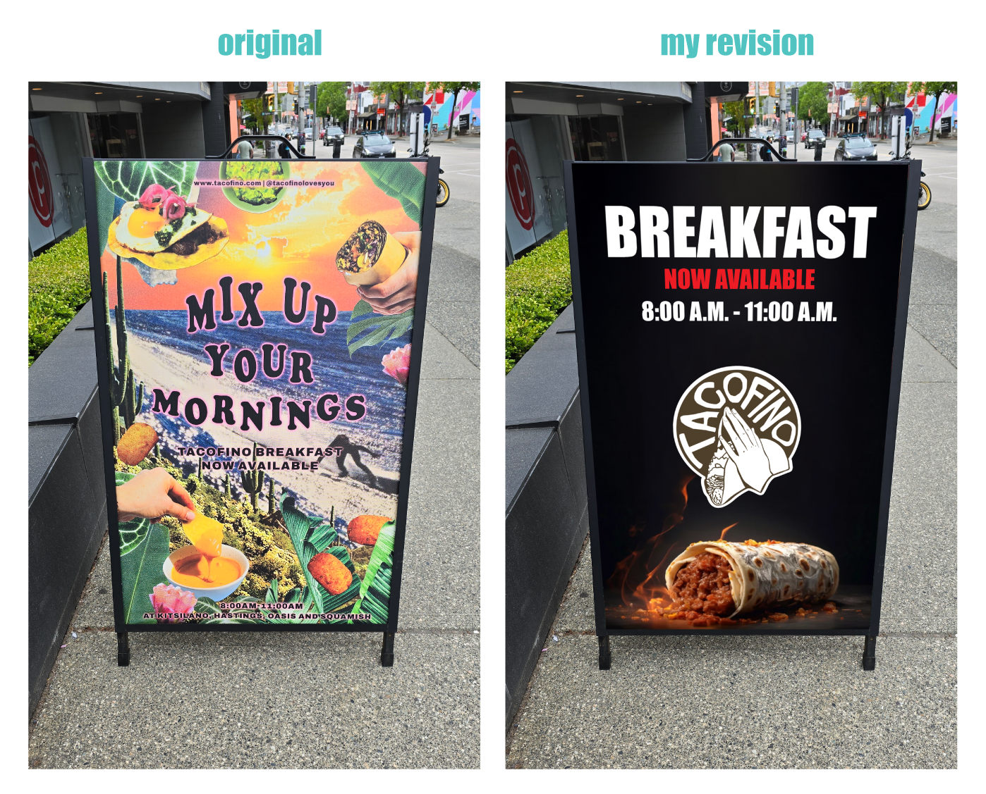
We’re redesigning neighbourhood signs today – this time, we’re revamping a new breakfast sign from Tacofino (found on West 4th Ave in Vancouver).
When looking at signage design, we have to consider the following:
👉 Purpose – What do you hope to achieve?
👉 Effectiveness – given your purpose, how likely will you achieve your goal?
👉 Clarity – How long would it take someone walking to understand your purpose?
👉 Hierarchy – Is there a clear order to what you want your customer to look at?
👉 Contrast – Is there enough contrast so that your message pops? Also, consider the environment. Will it stand out given it’s location, or will it blend in and become invisible?
👉 Branding – is it on-brand?
___________________________________________________________
So let’s begin.
👉 Purpose – Advertise Tacofino’s new breakfast menu.
👉 Effectiveness – Display a mouthwatering image that will appeal to our consumers’ desire to eat.
👉 Clarity – Let’s lead with the breakfast message and not the ‘mix up your mornings’ message, which isn’t very clear
👉 Hierarchy – We have one major headline, with subtext in a smaller font creating a clear visual hierarchy. We also have to consider how that plays in terms of the other visual elements on the sign.
👉 Contrast – Instead of a collage of colours and images, we’ve simplified it so that the message stands out on a dark background. The logo also has a border to help it pop.
👉 Branding – I’m not familiar enough with their branding so I just tried to make it look nice and clean.
What do you think, did I improve it, or do you prefer the original?